Osama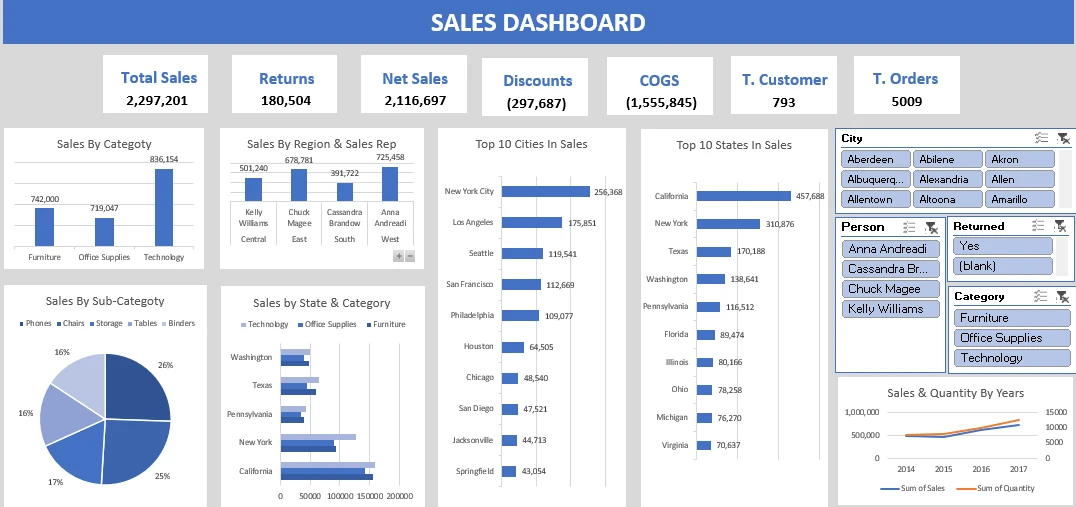
Excel · Data Visualization
Excel Dashboard
Project Brief
The goal was to take raw data and transform it into a clear, interactive Excel dashboard that helps stakeholders quickly understand business performance and key metrics without diving into complex sheets.
Challenges
- •Cleaning and formatting messy, inconsistent raw data.
- •Designing a dashboard that is both visually appealing and highly functional within Excel's limitations.
- •Creating dynamic charts that update automatically based on user-selected filters (slicers).
Solutions
- ✓Used Power Query to clean, transform, and load the raw data into a structured format.
- ✓Utilized Pivot Tables and Pivot Charts to create dynamic aggregations.
- ✓Designed a clean layout with consistent colors, aligned charts, and clear typography.
Impact
The final dashboard reduced reporting time significantly. Stakeholders can now filter data by date, region, or category in seconds, leading to faster and more data-driven decision making.
Technologies Used
- Excel
- Power Query
- Pivot Tables
- Data Visualization